Design Refresh for Google Web History
Google Web History is a service enabled by default when you create a Google account. It saves all your searches and the search results you click so you can quickly find them later and to help Google personalize results. It's called "Web History" instead of "Search History" because Google Toolbar has a feature that lets you send Google your browsing history.
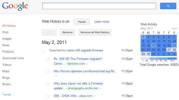
Google updated the Web History interface to make it more consistent and easier to use. The new interface seems to be optimized for removing searches, not for browsing your history. There's a huge checkbox button at the top of the page and a button for removing "all Web History". While it's nice to see that Google doesn't hide the button for deleting search/browsing history, using a button for such a rare and destructive action feels wrong. It's like placing a button labeled "Delete all your messages" in Gmail's toolbar.
The previous interface included a special mode for removing items. When you clicked "remove items", Google added checkboxes next to the items and a "remove" button. The standard interface included star icons so you can quickly bookmark pages. Now the stars are a lot smaller and more difficult to see. It's likely that most people who visit Google Web History want to remove items or clear the entire history, not to search Web History or to bookmark pages.

{ Thanks, Louis. }
Google updated the Web History interface to make it more consistent and easier to use. The new interface seems to be optimized for removing searches, not for browsing your history. There's a huge checkbox button at the top of the page and a button for removing "all Web History". While it's nice to see that Google doesn't hide the button for deleting search/browsing history, using a button for such a rare and destructive action feels wrong. It's like placing a button labeled "Delete all your messages" in Gmail's toolbar.
The previous interface included a special mode for removing items. When you clicked "remove items", Google added checkboxes next to the items and a "remove" button. The standard interface included star icons so you can quickly bookmark pages. Now the stars are a lot smaller and more difficult to see. It's likely that most people who visit Google Web History want to remove items or clear the entire history, not to search Web History or to bookmark pages.

{ Thanks, Louis. }
No comments:
Post a Comment