You might have noticed that Gmail looks a little different lately. We’ve made some changes at Google to make our products simpler and more consistent so that your experience can be more productive and enjoyable.
Why we made these changes
The way people use and experience the web is evolving, and our goal is to give you a more seamless and consistent online experience -- one that works no matter which Google product you’re using or what device you’re using it on. The new Google experience that we’re working toward is founded on three key design principles:
- Focus: With the design changes in the coming weeks and months, we’re bringing forward the stuff that matters to you and getting all the other clutter out of your way.
- Elasticity: The new design will soon allow you to seamlessly transition from your desktop computer to your mobile phone to your tablet, while keeping a consistent visual experience. We aim to bring you this flexibility without sacrificing style or usefulness.
- Effortlessness: Our design philosophy is to combine power with simplicity. We want to keep our look simple and clean. But behind the seemingly simple design, the changes use new technologies to make sure you have all the power of the web behind you.
What's changed
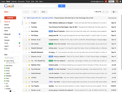
Throughout Gmail, you’ll notice some changes in layout and color. We’ve also minimized or removed borders in certain areas to create a cleaner look. Below you’ll find a summary of specific improvements:
We think you’ll find the new design easier to use. If your account has been upgraded but you’re not quite ready to make the switch, you can temporarily switch back to old look by clicking the gear icon in the top corner and selecting the option to postpone switching. Gmail will offer the new look to you again after several days.
Options at the top
We’ve cleaned up the Gmail toolbar, and it stays with you so that you can reach these options at any time. All of your familiar features are still there. Here’s how they’ve changed:
- Now you can access Contacts and Tasks by clicking Mail on the left, below the Gmail logo.
- Toolbar options like Archive, Spam, and Labels are now collapsed until you need them. Select or open a message to see actions you can take.
- Most toolbar options are now graphic icons or shorter text to keep your toolbar more consistent. They’re in the same order as before, and hovering over the buttons will remind you of their meaning.
Old: 
New:

- The +/- buttons have been removed. Instead, just click the importance tag on the left side of a message in the list, next to the sender’s name, to mark it as important or unimportant without opening it.
- Oldest and Newest navigation options have moved beneath the message range. Hover over 1-50 to reveal them.
- There’s a new gear icon to access your settings
 . Use it to change your theme, get help, and access all other Gmail settings.
- The settings gear also has a new set of options called "Display Density". Experiment with these options to adjust how much information you see on the page. Learn more about how to use this setting.
Using labels, chat, and gadgets
The left side of Gmail that includes your labels, chat, and any additional gadgets you’ve used to customize Gmail is now more adjustable, more responsive, and faster. Here are some specific changes:
- The column stays fixed in position as you scroll through your messages so that you don’t need to scroll up to get to your labels or chat list.
- Click and drag the solid line below your list of labels to adjust the height of the panel below them.
- If you have a large number of labels, moving the cursor over them will automatically expand the list, and moving the cursor away will automatically contract it. This way, you can keep them hidden until you need them.
- By default, labels and chat always show. If you’ve added other features to the left side of Gmail, such as the Google Calendar gadget or the Quick Links lab, switch between chat and your gadgets with the icons at the bottom.


- Gmail will remember the toggle position the next time you sign in.
- You can also click whichever icon is currently highlighted a second time to have neither chat nor gadgets show.
- If you want to turn chat off, you can do so by clicking the gear icon, choosing Settings, clicking the Chat tab, and changing the setting to disable it.
- You can use the arrow keys to navigate within the labels section, as well as between panels in Gmail.
- The grey “Compose mail” button now stands out in red, unless you’ve switched to a different theme.
Reading your messages
We’ve streamlined email messages to make them easier to read and to better show who’s involved in a conversation.
- When viewing the list of your messages, you can navigate via the arrow keys on your keyboard. A blue vertical line at the left shows which message is in focus, replacing the previous sideways arrows icon.
- Messages in a thread flow together as a conversation. We’ve made them easier to read by removing extra surrounding graphics.
- Put names to faces: images your contacts have selected to show (or images that you’ve selected to show for them) now appear next to each message.
- If no image exists for a sender, a default icon shows that is colored to help indicate who said what.
- The full list of message recipients is below the sender’s name. To show a long list, click the down arrow
 at the end of the row.
- Click the down arrow
 to reveal more details about each message, including cc assignment and exact date. This information was previously under the “show details” link.
- Stars for individual messages in a thread are now on the right side, next to the reply button.
- The “Reply” button on the right is now an icon

- Beneath the arrow to the right of the Reply button, you’ll find the options to filter messages similar to the current one, reply to the sender by chat, and others.
- Quoted text from earlier in the conversation is now collapsed within the "Show trimmed text" icon
 rather than a text link. Click it to show or hide the trimmed content. Signatures are also collapsed under an ellipsis.
- To mark messages you’re reading as important or not important, click the importance indicator next to the subject line. Or, click More in the application toolbar next to the "Move to" and "Labels" icons:


- Reply quickly using the box at the bottom of a conversation, or use the Reply, Reply to all, and Forward links within the box.
- The Archive, Spam, Delete, etc., options are no longer at the bottom of the message. These options stay fixed at the top while you move down the page, so they’re always on the screen.
Search and filters
Search in Gmail is easy and powerful. Use the search box at the top to find things in Gmail and on the web.
- There’s now a single magnifying glass button for Search. You can still use the same text box to “search Mail” and “search the Web.”
- Access the “Advanced search options” and “create a filter” tools using the small arrow in the search box. Clicking this arrow will open the new advanced search tool.
- If you want to create a filter to automatically take actions on your messages, after filling in the search terms, click “Create filter with this search” at the bottom of the advanced search tool. You’ll see your test search results behind a new set of options to help finish creating your filter.
- After you perform a search by clicking the magnifying glass icon, you’ll see the text version of your search term in the search box.
- You can still search across the web from the Gmail search box; when you type your query, an option to search the web will show up as a drop-down.

Settings
Most of your settings are the same, and you can access them by clicking the gear icon.

- Themes have been refreshed with new background color and image options. A small number of themes are no longer supported in the Gmail upgrade. We’re working to improve older themes and create new ones.
- It’s no longer possible to customize Web Clips with your chosen RSS feeds. If you previously customized them, visit the Web Clips tab of the Settings page to get a copy of your feeds list.
- It’s no longer possible to limit your contacts’ pictures to only the ones you’ve chosen for them. You’ll always see your contacts’ chosen pictures next to messages from those contacts; if you have contacts without associated pictures, you can still add ones of your own.
- If you need to use the basic HTML version of Gmail, access it here; if you always need to use the basic HTML version, change your setting when prompted.
Contacts
To access the contact manager in Gmail, first click
Mail at the top left and choose
Contacts.
- As in Mail, your toolbar buttons remain collapsed until you select or open a contact.
- The “Add to My Contacts” button is now an icon.

- The “Groups” button is now an icon.

- The “Email” button is now an icon.

- The left side of the page automatically expands on mouseover if you have a lot of contact groups, just like labels.
- To get to the end of your contacts list quickly, click the range of names at the top right of the list.
- You can still assign a picture to contacts who don’t have one of their own set, but you can no longer suggest that picture to the contact.
It’s no longer possible to access the older, deprecated contact manager.





 . Use it to change your theme, get help, and access all other Gmail settings.

 at the end of the row.
 rather than a text link. Click it to show or hide the trimmed content. Signatures are also collapsed under an ellipsis.


